Analyzing Track Evolution during the 2021 Formula One Season
How to acquire, prepare, and analyze Formula One lap data in R
By Colin Renville
April 19, 2022
Analysis Focus
This analysis is intended to be an introduction to Formula One qualifying data and a demonstration on how to prepare and clean data for a descriptive analysis on Track Evolution using machine learning and statistical modeling.
Introduction to Formula One
Formula One is a complicated sport. One way in particular that it separates itself from other motor sports in that the definition of “success” isn’t simply about one driver, but massive teams of hundreds or even thousands with the goal of building the best car possible and improving it over the course of a season. For the ten constructors (teams) currently racing in Formula One there are a variety of ways to achieve relative-success, but the first priority for every constructor to win the World Constructors Championship. This is done by each of a team’s respective two drivers combining for the most points compared to any other teams' two drivers on the grid during the season.
Wanting to know what contributes to a constructors' success can lead fans to a continuous and contentious cycle of questions. For example, these questions may be:
- Was one of a team’s drivers faster than the other?
- Are individual teams building cars that are generally faster than others'?
- What contributes to a team being fast?
The problem to directly answering a lot of questions about driver skill or pace is that there are a lot of influences on driver performance that are not, well, a driver’s performance. While F1 features some of the most-skilled racing drivers in the world, the car that a driver’s team builds for them will generally be the biggest factor in their success over the long-term. For starters, you can put the best drivers in the sport today - drivers near thte likes of Lewis Hamilton or Max Verstappen - in the 2021 Haas and they are likely not scoring a point during the season, let alone battling for the World Drivers Championship at the last race of the season in Abu Dhabi.
So we know that drivers across different teams cannot be compared on a level playing field, due to car speed and different strengths and weaknesses of each team’s car that individual drivers must adapt to, but there are also other factors to consider. I would like to think we could use race results to compare drivers within teams, but even then there are many factors at play during the race. For instance, F1 cars have many different engine modes and mappings to deploy stored energy (known as KERS: Kinetic Energy Recovery System), or more-simply put: ways to pick-and-choose when and where to maximize speed of the car throughout a lap around the circuit.
So now that we can generally rule out the race as a level-playing field for analysis, we can turn our attention to another event during the race weekend: qualifying. Qualifying is perhaps the only session in a Grand Prix weekend in which drivers within teams can be judged on a level playing field. The goal for qualifying is simple: go as fast as possible over one lap. While it is very possible for some drivers to be faster over one lap and there may be some general set up differences (faster through corners at a cost of straight-line speed or vice-versa), rather than in race conditions, this is the only time for a team’s drivers to be on equal engine modes and similar fuel levels. So with that, we know that there is one additional variable that plays into all cars' performance throughout a session, which is a term known as track evolution.
Track evolution is what we’ll primarily be interested in exploring for this analysis, and is the result of track conditions becoming more conducive to faster laps as more laps are run throughout a session (under dry conditions). As F1 cars drive around a track, their tires shed large amounts of rubber as they wear which gets ingrained into the fibers, cracks, and crevices of a track’s surface. As this happens, cars have more-and-more grip as the rubber from tires meets the progressively-grippier and rubber-filled track surface. This phenomenon is a big reason why lap times typically improve, for all teams, as a session progresses.
So how can we attempt to analyze this effect?
Data Acquisition
Fortunately, there are now ways for the general public to capture F1 data, and thanks to the FastF1 API, it is possible for me to get my hands on and analyze. The one caveat to this API is that it utilizes Python, while I am more adept with a statistical programming language known as R. Because of this, I had to create the functions to extract the data in Python and use an R package called reticulate to load that data into R.
Sys.setenv(RETICULATE_PYTHON = "/Users/colinrenville/.pyenv/versions/3.9.9/bin/python3.9")
With this code, there are various functions that I have created in a Python script which allows us to call on the source_python function from the reticulate package to call the functions created in Python from R.
reticulate::source_python("ExploreF1_data_pull.py")
Analyzing one race weekend: Abu Dhabi
Now we can call the function: get_driver_data directly from R, and load data for the Abu Dhabi’s 2021 qualifying session.
ad_quali_2021_l <- get_driver_data(season = '2021',
                                   circuit = 'Abu Dhabi',
                                   session = 'Q',
                                   driver = 'ALL',
                                   data_type = 'laps')
So let’s take a look at 5 rows of laps from Lewis Hamilton in the data we just loaded in to get a sense of what we’re working with..
ad_quali_2021_l %>%
  dplyr::filter(DriverNumber == "44") %>%
  head()
      Time DriverNumber LapTime LapNumber Stint PitOutTime PitInTime Sector1Time Sector2Time Sector3Time Sector1SessionTime Sector2SessionTime Sector3SessionTime SpeedI1 SpeedI2 SpeedFL SpeedST Compound TyreLife FreshTyre LapStartTime     Team Driver TrackStatus IsAccurate        LapStartDate season  raceName session
1 1191.500           44     NaN         1     1   1083.961       NaN         NaN      46.679      39.069                NaN           1152.431           1191.747     248     237     226     223     SOFT        1      TRUE     1083.961 Mercedes    HAM           1      FALSE 2021-12-11 07:03:04   2021 Abu Dhabi       Q
2 1274.766           44  83.266         2     1        NaN       NaN      17.071      36.030      30.165           1208.571           1244.601           1274.766     292     315     224     319     SOFT        2      TRUE     1191.500 Mercedes    HAM           1       TRUE 2021-12-11 07:04:51   2021 Abu Dhabi       Q
3 1388.473           44 113.707         3     2        NaN  1387.394      26.719      46.209      40.779           1301.485           1347.694           1388.473     226     219     NaN     226     SOFT        1      TRUE     1274.766 Mercedes    HAM           1      FALSE 2021-12-11 07:06:14   2021 Abu Dhabi       Q
4 2018.317           44     NaN         4     2   1901.450       NaN         NaN      46.828      44.612                NaN           1973.800           2018.547     257     228     226     224     SOFT        5     FALSE     1388.473 Mercedes    HAM           5      FALSE 2021-12-11 07:08:08   2021 Abu Dhabi       Q
5 2101.162           44  82.845         5     2        NaN       NaN      16.975      35.788      30.082           2035.292           2071.080           2101.162     293     317     225     320     SOFT        6     FALSE     2018.317 Mercedes    HAM           1       TRUE 2021-12-11 07:18:38   2021 Abu Dhabi       Q
6 2207.808           44 106.646         6     3        NaN  2206.297      19.995      46.528      40.123           2121.157           2167.685           2207.808     185     262     NaN     224     SOFT        4     FALSE     2101.162 Mercedes    HAM           1      FALSE 2021-12-11 07:20:01   2021 Abu Dhabi       Q
Even for this small sample of laps for Lewis Hamilton, already, I will list out some issues that I see:
- There are particular values labeled “NaN”. These are values that are missing entirely.
- The LapTime column has values that vary heavily.
Data Cleaning and Preparation
Digging into the LapTime column, and relating it to what’s happening in a qualifying session for a driver, we can theorize why there might be no lap time for a driver, or why there would be a high or low value for a lap time when it does exist. The answer is pretty simple in that this dataset effectively gives us a row of data for every time a driver passes the start/finish line. This forces us to think about what we truly want out of this analysis. For instance, drivers will almost always exit the pit lane and coast around the track (Out Lap) prior to their fast lap to avoid tire wear, and then once again coast around to the pits following their fast lap (In Lap). We do not want these In Laps and Out Laps included in our analysis of track evolution, and creating our first plot below of all lap times we can see why this is problematic.
ad_quali_2021_l %>%
  ggplot(aes(x = LapStartTime, y = LapTime)) +
  geom_point(color = "#5a0d9e",
             alpha = 0.6) +
  labs(title = "Abu Dhabi 2021 Qualifying, all laps from raw data",
       subtitle = expression(paste("Plotting the entire dataset shows we have fast laps and slow laps, we are also missing Lap Times for ", bold("106 of 328 laps"))),
       x = "Lap Start Time",
       y = "Lap Time") +
  scale_x_continuous() +
  sec_lab_convert(axis = "y",
                  int_sec = 10) +
  theme_main() +
  theme_main_add()
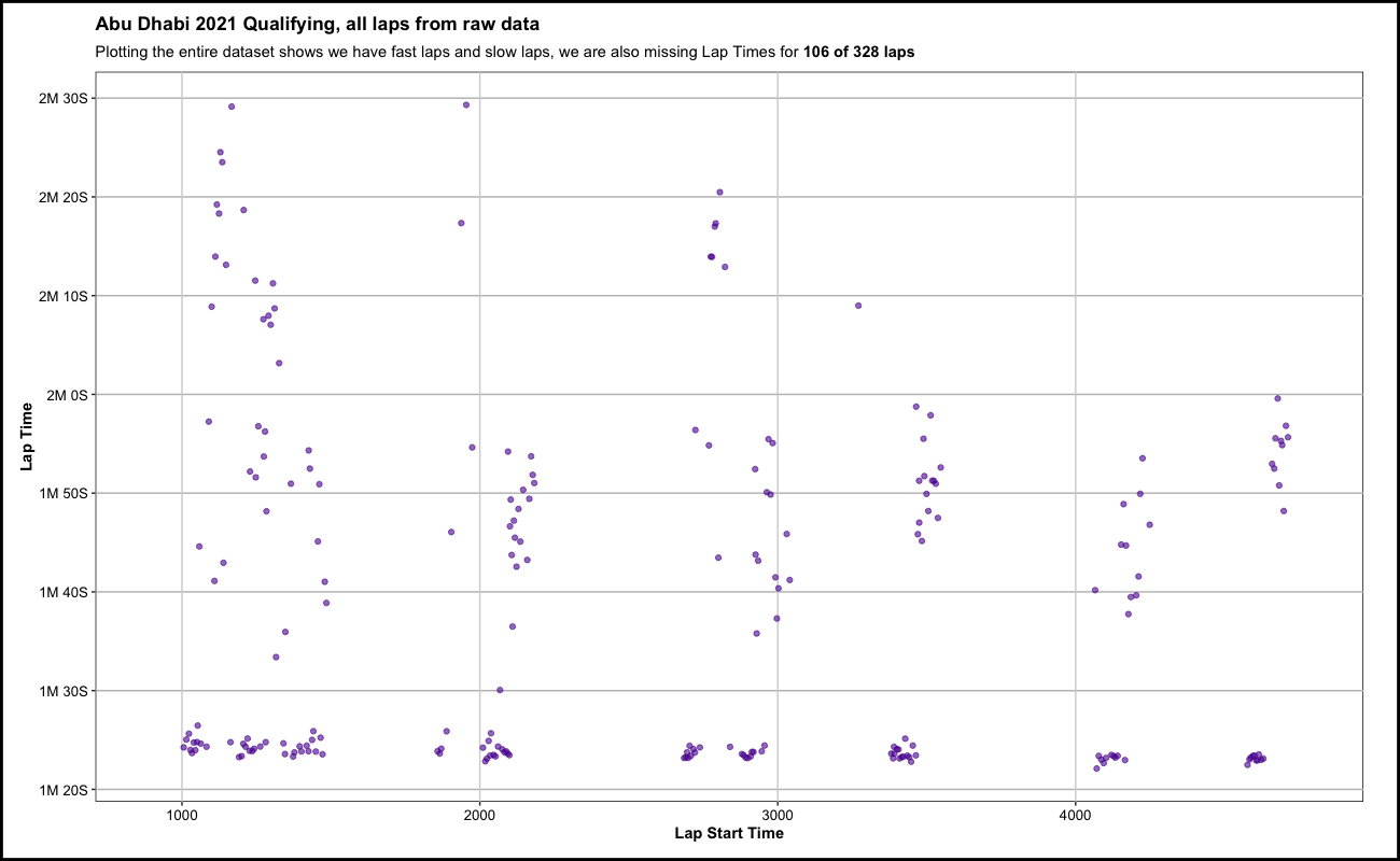
Now that’s kind of a a mess - but, it’s an informative mess. We can see genuine separation for Lap Times between what we can assume to be fast laps (huddled around the 1M 25S mark of the y axis) and slow laps at higher times on the y-axis that also have more variance in comparison.
This is where the data cleaning really begins. And while the next code chunk may be a blob of code, I aim to at least show specific cases of incorrect data and what I am doing to treat these cases.
Below will be data cleaning for the following cases:
- Missing sector times
- Missing LapTime
- No session number data
ad_quali_2021_l <- ad_quali_2021_l %>%
  # prune out what isnt being used below
  # arrange(LapStartTime) %>%
  group_by(Driver) %>%
  mutate(Compound = factor(Compound, levels = c("SOFT", "MEDIUM", "HARD")),
         LapTime_per = seconds_to_period(LapTime),
         next_lap_StartTime = lead(LapStartTime),
         Sector1SessionTime2 = (next_lap_StartTime - (Sector2Time + Sector3Time)),
         Sector1Time3 = (next_lap_StartTime - PitOutTime - Sector2Time - Sector3Time),
         Sector3Time2 = (PitInTime - Sector2SessionTime),
         LapTime4 = coalesce(LapTime,
                             (Sector1Time + Sector2Time + Sector3Time),
                             (Sector1Time3 + Sector2Time + Sector3Time)),
         Sector1Time_outlap = ifelse(!is.na(PitOutTime), (Sector2SessionTime-PitOutTime-Sector2Time), NA),
         # LapStartTime alone should not be used for this logic
         # use PitOutTime as LapStartTime for outlaps, LapStartTime for non-outlaps
         coal_LapStartTime = coalesce(PitOutTime, LapStartTime),
         LapTime5 = coalesce(LapTime4,
                            (PitInTime - LapStartTime) # for laps occuring during a red flag
                            ),
         InLap_flag = if_else(!is.na(PitInTime), 1, 0),
         OutLap_flag = if_else(!is.na(PitOutTime), 1, 0),
         coal_Sector1Time = coalesce(Sector1Time, Sector1Time3),
         coal_Sector3Time = coalesce(Sector3Time, Sector3Time2)) %>%
  ungroup() %>%
  group_by(season, raceName) %>%
  mutate(lap_start_rownum = (dplyr::row_number(coal_LapStartTime) - 1),
         scale_LapTime5 = scale(LapTime5)) %>%
  ungroup()

# editing below...

ad_quali_2021_l_scaled <- ad_quali_2021_l %>%
  # any filtering that gets added to hclust_exlude() needs to be replciated here
  filter(InLap_flag == 0 & OutLap_flag == 0) %>%
  select(raceName, season, Driver, DriverNumber, LapNumber, InLap_flag,
         OutLap_flag, coal_Sector1Time, Sector2Time, coal_Sector3Time,
         LapTime5, scale_LapTime5) %>%
  mutate(scale_Sector1Time = scale(coal_Sector1Time),
         scale_Sector2Time = scale(Sector2Time),
         scale_Sector3Time = scale(coal_Sector3Time),
         scale_LapTime5_filtered = scale(LapTime5)) %>%
  select(-c(Driver, LapTime5, InLap_flag, OutLap_flag, coal_Sector1Time, Sector2Time,
            coal_Sector3Time, scale_LapTime5))

# rejoin scaled, filtered data onto primary df

ad_quali_2021_l <- ad_quali_2021_l %>%
  left_join(ad_quali_2021_l_scaled, by = c("season" = "season",
                                     "raceName" = "raceName",
                                     "DriverNumber" = "DriverNumber",
                                     "LapNumber" = "LapNumber"))
0. Here is what a clean row of data should look like (fast lap)
This lap below by Lewis Hamilton, is a lap we know to be his last fast lap attempt of Q3 from film. Further, this was his fastest lap of the session. Using this info we can see in his data below that there are correctly no values for PitInTime or PitOutTime, in addition to accurate values for all sector time fields and a matching value for the columns LapTime and my created column: LapTime5.
ad_quali_2021_l %>%
  select(Driver, DriverNumber, LapNumber, PitInTime, PitOutTime,
           Sector1SessionTime, Sector2SessionTime, Sector3SessionTime,
           Sector1Time, Sector2Time, Sector3Time, LapTime,
           LapTime5) %>%
  filter(Driver == "HAM" & LapNumber == 17)
  Driver DriverNumber LapNumber PitInTime PitOutTime Sector1SessionTime Sector2SessionTime Sector3SessionTime Sector1Time Sector2Time Sector3Time LapTime LapTime5
1    HAM           44        17       NaN        NaN           4593.954           4629.737           4659.532      16.902      35.783      29.795   82.48    82.48
What is LapTime5? This is a calculated column by me to use in cases where there is no value for LapTime, but we can calculate what a driver’s lap time is by using other fields that are filled.
For example…
1. Laps with missing sector times
selected_lap_vars <- c("Sector1Time", "Sector2Time")

ad_quali_2021_l %>%
  select(Driver, DriverNumber, LapNumber, PitInTime, PitOutTime,
         Sector1SessionTime, Sector2SessionTime, Sector3SessionTime,
         Sector1Time, Sector2Time, Sector3Time, LapTime,
         LapTime5) %>%
    filter(if_any(selected_lap_vars, is.na)) %>%
  as.data.frame() %>%
  tail(10)
    Driver DriverNumber LapNumber PitInTime PitOutTime Sector1SessionTime Sector2SessionTime Sector3SessionTime Sector1Time Sector2Time Sector3Time LapTime LapTime5
99     RAI            7         1       NaN    941.005                NaN           1008.874           1058.579         NaN      44.707      49.475     NaN  117.344
100    RAI            7         5  1709.626   1587.710                NaN                NaN                NaN         NaN         NaN         NaN     NaN  350.293
101    RAI            7         6       NaN   1782.394                NaN           1848.256           1888.635         NaN      45.355      40.136     NaN  105.998
102    MSC           47         1       NaN    908.732                NaN            979.715           1023.636         NaN      47.376      43.698     NaN  114.681
103    MSC           47         4       NaN   1341.744                NaN           1410.758           1465.733         NaN      44.561      54.742     NaN  123.756
104    MSC           47         6  1660.142        NaN           1569.781                NaN                NaN      18.975         NaN         NaN     NaN  109.406
105    MSC           47         7       NaN   1907.108                NaN           1977.142           2029.482         NaN      46.363      52.399     NaN  122.347
106    MAZ            9         1       NaN    923.264                NaN           1003.977           1053.087         NaN      46.350      48.904     NaN  129.617
107    MAZ            9         4       NaN   1320.601                NaN           1396.984           1441.344         NaN      51.407      44.141     NaN  120.524
108    MAZ            9         7       NaN   1911.908                NaN           1981.190           2037.596         NaN      43.316      56.336     NaN  125.457
For our first problematic lap example below, it is one of the more common cases in which a driver enters or exits the pit lane during the lap. By F1 standards, this makes sense as to why there isn’t an official lap time as the entrance of pit lane is prior to the start/finish line and the exit of pit lane is after the start/finish line. So this leads to a bit of a gap in the data for these In Laps and Out Laps.
Below is an In Lap from Lando Norris. He had just finished a fast lap and is coasting around the track to come in to the pits between fast laps runs. Unfortunately, there is a very odd combination of missing fields from the data below. We are missing Sector 2 and Sector 3 information, which in turn leads to a missing LapTime. Fortunately, we can back into a derived lap time as you can probably see with our LapTime5 variable being populated below.
For this particular set of cases, we can start by subtracting Sector1SessionTime from PitInTime. While technically, using PitInTime means the time in which Lando enters the pits as opposed to crossing the start/finish line, this is the best we’ll be able to do for this particular problem as well as there not being any harmful drawbacks in the few seconds difference for this particular analysis. Finally, since Sector1SessionTime is the time in which the driver completed the sector, we need to also subtract Sector1Time (the time spent in sector 1, as opposed to the time of completing the sector).
When we calculate: PitInTime: 1669.06 - (Sector1SessionTime: 1575.146 - Sector1Time: 19.763), we get our derived lap time in this case of 113.665 seconds. This is a very slow lap, denoting the time it took Lando Norris to get from the start/finish line to the pit lane entrance.
selected_lap_vars <- c("Sector1Time", "Sector2Time")

ad_quali_2021_l %>%
  select(Driver, DriverNumber, LapNumber, PitInTime, PitOutTime,
         Sector1SessionTime, Sector2SessionTime, Sector3SessionTime,
         Sector1Time, Sector2Time, Sector3Time, LapTime,
         LapTime5) %>%
    filter(if_any(all_of(selected_lap_vars), is.na)) %>%
  filter(Driver == "NOR" & LapNumber == 5) %>%
  as.data.frame()
  Driver DriverNumber LapNumber PitInTime PitOutTime Sector1SessionTime Sector2SessionTime Sector3SessionTime Sector1Time Sector2Time Sector3Time LapTime LapTime5
1    NOR            4         5   1669.06        NaN           1575.146                NaN                NaN      19.763         NaN         NaN     NaN  113.665
2. Laps with missing lap times
For this next example, we’ve got a case that’s a little more straightforward. This is a slow Out Lap by Valterri Bottas. This lap has populated data for sectors 2 and 3, with missing data for sector 1. This seems to be because of exiting the pit lane, which is somewhere near the middle of sector 1. Once again, this is an edge case in the data and we will treat these particular set of cases as if the exit of the pit lane is the beginning of these slow laps. We can get away with this because slow laps in F1 are generally very slow in comparison to fast laps - the few seconds “gained” from starting a drivers slow lap from the exit of the pit lane (which we know) instead of the start/finish line (which we don’t know) will not hurt us for this analysis.
Below, we can simply take the (Sector2SessionTime: 3351.012 - PitOutTime: 3274.034) to yield our sector 1 time of 30.85. Then we can take our derived Sector1Time: 30.85 + Sector2Time: 46.128 + Sector3Time: 71.12 to give us our calculated LapTime5 of 148.098. Another really slow lap, but we now at least have a lap time for it.
ad_quali_2021_l %>%
  select(Driver, DriverNumber, LapNumber, PitInTime, PitOutTime,
         Sector1SessionTime, Sector2SessionTime, Sector3SessionTime,
         Sector1Time, Sector2Time, Sector3Time, LapTime,
         LapTime5) %>%
    filter(if_any(all_of(selected_lap_vars), is.na)) %>%
  filter(Driver == "BOT" & LapNumber == 12) %>%
  as.data.frame()
  Driver DriverNumber LapNumber PitInTime PitOutTime Sector1SessionTime Sector2SessionTime Sector3SessionTime Sector1Time Sector2Time Sector3Time LapTime LapTime5
1    BOT           77        12       NaN   3274.034                NaN           3351.012           3422.179         NaN      46.128       71.12     NaN  148.098
3. Data with no session numbers
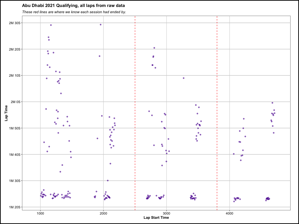
I am going to bring back the plot from above from the start of the Data Cleaning and Preparation section, to dive into more details that I left out before. Before, I mentioned the separation in lap times from top to bottom on the y-axis. But if you look on the x-axis, for session progress, you’ll notice that there are clear separations there as well. This leads us to our next section of data cleaning: for qualifying sessions - which we actually do not have data for in this dataset.
ad_quali_2021_l %>%
  ggplot(aes(x = LapStartTime, y = LapTime)) +
  geom_point(color = "#5a0d9e",
             alpha = 0.6) +
  labs(title = "Abu Dhabi 2021 Qualifying, all laps from raw data",
       subtitle = "These red lines are where we know each session had ended by.",
       x = "Lap Start Time",
       y = "Lap Time") +
  scale_x_continuous() +
  sec_lab_convert(axis = "y",
                  int_sec = 10) +
  geom_vline(xintercept = 2500,
             color = "red",
             linetype = "dashed") +
  geom_vline(xintercept = 3800,
             color = "red",
             linetype = "dashed") +
  theme_main() +
  theme_main_add()
Qualifying is done by way of elimination across three sessions. For the first session, all 20 drivers on the grid have 18 minutes to score as fast of a lap as possible. At the end of the first 18 minutes, the 5 drivers with the slowest lap times are eliminated, with their starting position set for the race. Session 2 features 15 minutes for the remaining 15 drivers to do the same thing again, until the next 5 drivers with the slowest lap times are eliminated before the final, 12 minute session featuring the remaining 10 drivers.
Unfortunately, the data at-hand does not include data for the session number within qualifying. Because of this, logic needs to be created to derive this so that it can be used in the analysis.
One key piece of information that we know is that each break, between the first and second qualifying sessions (referred to as Q1 and Q2) is at least five minutes long. Judging by F1 qualifying footage from the 2021 season, this timer begins once the track is clear from the ending session. This information allows us to store this as a variable in R (in seconds) and then proceed with our logic.
# breaks in between quali sessions are 300 seconds / 5 minutes

break_seconds <- 300
While the below code is a total blob of text, the important thing to know is that it creates session numbers for Abu Dhabi’s qualifying session. This is done with the following assumptions in mind: That the only 5 minute periods without a lap completed in a qualifying session are the breaks in qualifying.
Abu Dhabi had a relatively-clean qualifying session that holds this assumption. While there was a quick red flag during the first session of Abu Dhabi’s qualifying, this was the quickest of the year to simply remove loose debris from the track near the end of the first session.
There were numerous qualifying sessions throughout the season that did not hold our key assumption above, which require need more-stringent and case-specific data cleaning.
Things that worked for Abu Dhabi’s data cleaning logic, but prove problematic for data cleaning are:
- Red flags in qualifying, causing any two laps by any driver to be more than 5 minutes apart
- There always being two laps in a session within 5 minutes of each other
- This could be caused by bad data in theory
quali_reference_data <- ad_quali_2021_l %>%
  mutate(Sector1Time_outlap = ifelse(!is.na(PitOutTime), (Sector2SessionTime-PitOutTime-Sector2Time), NA),
         # LapStartTime alone should not be used for this logic
         # use PitOutTime as LapStartTime for outlaps, LapStartTime for non-outlaps
         coal_LapStartTime = coalesce(PitOutTime, LapStartTime)) %>%
  arrange(coal_LapStartTime) %>% # this is important
  mutate(last_coal_LapStartTime = lag(coal_LapStartTime),
         last_coal_LapStartTime_delta = (coal_LapStartTime - last_coal_LapStartTime),
         session_break_flag_coal = ifelse(last_coal_LapStartTime_delta >= break_seconds, 1, 0)) %>%
  fill(session_break_flag_coal, .direction = "up") %>%
  mutate(session_number_coal = as.factor(as.character((cumsum(session_break_flag_coal) + 1)))) %>%
  # dont think the below LapStartTime session breaks will be needed
  arrange(LapStartTime) %>% # this is important
  mutate(last_LapStartTime = lag(LapStartTime),
         last_LapStartTime_delta = (LapStartTime - last_LapStartTime),
         # have to control here for cases where there may be > 5 min pause because of red flags (TrackStatus: 5)
         # session_break_flag = ifelse((TrackStatus != "5" & last_LapStartTime_delta) >= break_seconds, 1, 0),
         session_break_flag = ifelse(last_LapStartTime_delta >= break_seconds, 1, 0),
         session_break_flag2 = session_break_flag) %>%
  fill(session_break_flag2, .direction = "up") %>%
  mutate(session_number = as.factor(as.character((cumsum(session_break_flag2) + 1)))) %>% # filter(Driver %in% c("SAI", "LEC", "GIO"))
  select(-c(last_coal_LapStartTime, last_coal_LapStartTime_delta,
            session_break_flag_coal, last_LapStartTime, last_LapStartTime_delta,
            session_break_flag, session_break_flag2)) # removing all columns that were added


quali_reference_data %>%
  select(Time, DriverNumber, LapTime5, session_number_coal, LapNumber) %>%
  as.data.frame() %>%
  slice(c(160:170))
       Time DriverNumber LapTime5 session_number_coal LapNumber
1  2262.480           18  103.234                   1        10
2  2275.538           31  109.426                   1         8
3  2285.996           14  113.733                   1         6
4  2289.222           55  111.848                   1        10
5  2293.664           16  111.026                   1        11
6  2685.807           44  102.494                   2         7
7  2723.564            5  113.884                   2        11
8  2691.848           77  104.832                   2         7
9  2738.748           99  107.728                   2        10
10 2708.505           22  117.397                   2        10
11 2704.237           10  114.833                   2        10
Above, there is an additional variable / column created in the lap dataset for session number: session_number_coal. Now that this variable is created, we can validate that its behavior matches what we expect - shown below by creating a summary table of this new session number variable.
Below, we can see that - for each session - we can calculate the number of unique drivers, earliest and latest times in which a lap started, and if there was a red flag (1:yes, 0:no). According to our summary table, we’ve got 20 drivers in Q1, 15 in Q2, and 10 in Q3, along with at least 5 minutes (300 seconds) between the highest lap start time in Q1 and lowest lap start time in Q2, .etc. Everything looks good on the surface.
# aggregate to impute quali session start times

quali_reference_agg_coal <- quali_reference_data %>%
  group_by(session_number_coal) %>%
  summarize(dis_Drivers = n_distinct(Driver),
            min_coal_LapStartTime = min(coal_LapStartTime),
            max_coal_LapStartTime = max(coal_LapStartTime),
            max_RedFlag = max(ifelse(TrackStatus == "5", 1, 0)))

# view

quali_reference_agg_coal %>%
  # making names more interpretable
  rename("SessionNumber" = "session_number_coal",
         "Num_of_Drivers" = "dis_Drivers",
         "min_Session_LapStartTime" = "min_coal_LapStartTime",
         "max_Session_LapStartTime" = "max_coal_LapStartTime",
         "RedFlag" = "max_RedFlag")
Now we’ve got a reference table of sorts…
  SessionNumber Num_of_Drivers min_Session_LapStartTime max_Session_LapStartTime RedFlag
1             1             20                  903.118                 2182.638       1
2             2             15                 2583.313                 3547.218       0
3             3             10                 3963.465                 4772.495       0
… that we can join onto our primary, lap-level dataset
ad_quali_2021_l <- ad_quali_2021_l %>%
  fuzzyjoin::fuzzy_join(quali_reference_agg_coal,
                    by = c("coal_LapStartTime" = "min_coal_LapStartTime",
                           "coal_LapStartTime" = "max_coal_LapStartTime"),
                    match_fun = list(`>=`, `<=`))

# using verstappens whole quali as example

ad_quali_2021_l %>%
  dplyr::filter(DriverNumber == "33") %>%
  select(Time, DriverNumber, LapTime5, session_number_coal) %>%
  as.data.frame()
       Time DriverNumber LapTime5 session_number_coal
1  1033.438           33  115.558                   1
2  1117.118           33   83.680                   1
3  1256.346           33  139.228                   1
4  1373.118           33  116.772                   1
5  1456.440           33   83.322                   1
6  1561.548           33  105.108                   1
7  2699.616           33  103.320                   2
8  2782.805           33   83.189                   2
9  2934.311           33  151.478                   2
10 3037.467           33  103.156                   2
11 3447.822           33  164.328                   2
12 3530.622           33   82.800                   2
13 3641.571           33  110.949                   2
14 4070.822           33  106.125                   3
15 4152.931           33   82.109                   3
16 4257.718           33  104.787                   3
17 4615.119           33  124.254                   3
18 4698.660           33   83.541                   3
19 4806.851           33  108.191                   3
Now we can take all of the work that we have done to clean our data to this point and plot every lap, for all drivers, along with separating these laps by the new session number variable that we derived.
ad_quali_2021_l %>%
  ggplot(aes(x = coal_LapStartTime, y = LapTime5)) +
  geom_point(color = "#5a0d9e",
             alpha = 0.6) +
  labs(title = "Abu Dhabi 2021 Qualifying, all laps from raw data",
       subtitle = "All laps, separated by qualifying session number",
       x = "Lap Start Time",
       y = "Lap Time") +
  coord_cartesian(ylim = c(80,190)) +
  scale_x_continuous() +
  sec_lab_convert(axis = "y") +
  facet_wrap(~session_number_coal,
             nrow = 1,
             scales = "free_x") +
  theme_main() +
  theme_main_add()
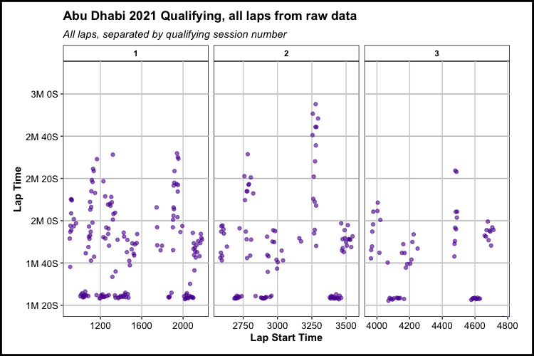
Above we have been able to look at laps individually, as the qualifying session progresses, but what can we actually get out of that? Not too much, with that plot at face value. One thing is definitely clear in that there is a large separation / high variance in individual laps. There is a high density of laps between 1M 20S and 1M 30S and many laps that are clearly separated from the fastest set of laps from roughly 1M 35S and higher.
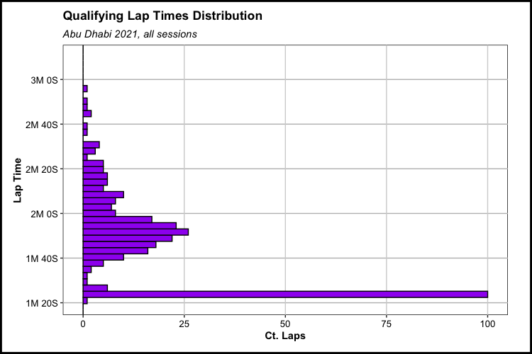
We can summarize these lap times in a histogram below for the entire qualifying session to visualize this a bit better. In the histogram, we can see two definite peaks in the distribution. The first peak that stands out is the stark number of laps that we can group together in the 1M 20S - 1M 25S range. The other peak is a more-gradual, less-dense peak that contain much slower lap times.
ad_quali_2021_l %>%
  # filter(is.na(PitOutTime),
  #        is.na(PitInTime)) %>%
  ggplot(aes(y = LapTime5)) +
  geom_histogram(fill = "purple",
                 color = "black",
                 bins = 100) +
  labs(title = "Qualifying Lap Times Distribution",
       subtitle = "Abu Dhabi 2021, all sessions",
       x = "Ct. Laps",
       y = "Lap Time",
       color = "Tire") +
  coord_cartesian(ylim = c(80,190)) +
  # scale_x_continuous(breaks = seq(0,20,1)) +
  sec_lab_convert(axis = "y") +
  # facet_wrap(~as.factor(session_number_coal),
  #            scales = "free_x") +
  geom_hline(aes(yintercept = mean(LapTime4)),
             linetype = "dashed",
             color = "red") +
  theme_main() +
  theme_main_add()
What we see here is the effect of drivers taking their slow laps versus their fast laps. Drivers stints during their qualifying runs most-often consistent with the following pattern:
- Driver exits the pit lane and continues on a slow Out Lap
- A driver’s Out Lap routine is dependent on the circuit and the abrasiveness of the asphalt. A driver may nearly coast during their Out Lap to not cause needless and excessive tire wear on abrasive (Ex: Silverstone) or particularly long circuits (Ex: COTA) or, less often, they may opt to vigorously warm up their tires or even take multiple Out Laps on tracks friendlier to tires (Ex: Portimão). This is all part of the balance that teams need to find at each circuit.
- Fast Lap begins once the driver makes it around the track and to the start / finish line, puts in full effort pushes the car to the limit
- At very niche tracks, such as Monaco, drivers may do multiple fast laps - but this is very rare throughout the season as a whole
- After a driver’s fast lap(s), they’ll begin their In Lap which is generally a slow trek around the circuit and back into the pit lane and then the garage to refuel and change tires, if desired
Since we are looking to purely look to measure how much faster Fast Laps are getting throughout qualifying sessions, we need to design a way to efficiently predict to a reasonably-accurate degree if a lap as a Fast Lap or a Slow Lap. Consistent with the session number work above, the dataset we are using does not tell us if a driver is on a Fast Lap or not. This interpretation between Fast and Slow laps is also something that can be subjective, which I will detail later on.
Clustering
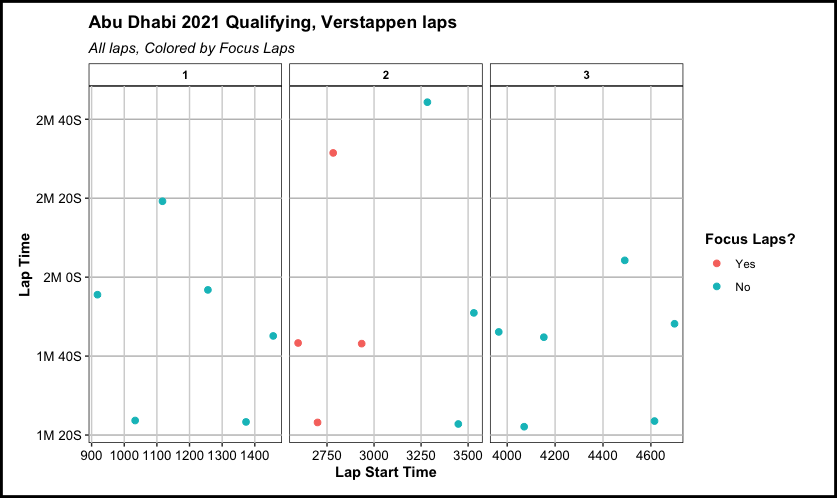
In order to lay the groundwork for my idea on predicting a Fast Lap vs. a Slow lap, let’s look at a specific set of laps by Max Verstappen. This set of four laps was a stint from Verstappen’s qualifying to begin Q2. Recalling our derived variable for lap times, LapTime5, we can see that the data shows a slow Out Lap, a fast lap, a slow lap, and the stint ends with a slow, In Lap. They key note here is the definite separation between Verstappen’s fast lap at 83.189 seconds that are all over 100 seconds. Assuming that there is this kind of separation in time between most slow laps and fast laps, we should be able to predict for these using the right tools.
ad_VER_focus_laps <- ad_quali_2021_l %>%
  select(Driver, DriverNumber, LapNumber, PitInTime, PitOutTime,
         Sector1SessionTime, Sector2SessionTime, Sector3SessionTime,
         Sector1Time, Sector2Time, Sector3Time, LapTime,
         LapTime5) %>%
  mutate(ver_focus_flag = "1") %>%
  dplyr::filter(Driver == "VER",
                between(LapNumber, 7, 10))


ad_VER_focus_laps %>%
  select(Driver, DriverNumber, LapNumber, PitInTime, PitOutTime, LapTime5) %>%
  as.data.frame()
  Driver DriverNumber LapNumber PitInTime PitOutTime LapTime5
1    VER           33         7       NaN   2596.296  103.320
2    VER           33         8       NaN        NaN   83.189
3    VER           33         9       NaN        NaN  151.478
4    VER           33        10  3036.302        NaN  103.156
The plot below shows where these three laps fit in to Verstappen’s entire qualifying session. Note the sheer separation between the laps just higher than the 1M 20S mark compared to every other lap:
ad_quali_2021_l %>%
  left_join(ad_VER_focus_laps %>% select(Driver, LapNumber, ver_focus_flag),
            by = c("Driver" = "Driver",
                   "LapNumber" = "LapNumber")) %>%
  mutate(ver_focus_flag = ifelse(!is.na(ver_focus_flag), "Yes", "No"),
         ver_focus_flag = factor(ver_focus_flag, levels = c("Yes", "No"))) %>%
  dplyr::filter(Driver == "VER") %>%
  ggplot(aes(x = coal_LapStartTime, y = LapTime5, color = ver_focus_flag)) +
  geom_point(#color = "#5a0d9e",
             alpha = 1,
             size = 2) +
  labs(title = "Abu Dhabi 2021 Qualifying, Verstappen laps",
       subtitle = "All laps, Colored by Focus Laps",
       x = "Lap Start Time",
       y = "Lap Time",
       color = "Focus Laps?") +
  # coord_cartesian(ylim = c(80,190)) +
  scale_x_continuous() +
  sec_lab_convert(axis = "y") +
  facet_wrap(~session_number_coal,
             nrow = 1,
             scales = "free_x") +
  theme_main() +
  theme_main_add()
This brings us to the topic of clustering, a family of predictive models that we will explore to differentiate fast laps from slow laps. As a brief overview, in the machine learning realm there are many predictive models to use depending on the goal. These predictive models can largely be categorized between two types: Supervised and Unsupervised.
Supervised models are used when there is tangible data that exists for a dependent variable to predict for. An example of this could be having a dataset of wine ratings from a website with facts and attributes of those wines. In that case, wine ratings would be the dependent variable and we would have that not only to predict for, but also be able to directly know the accuracy / strength of the model created.
Our dataset does not have data for a fast or slow “Lap Type”, which is what we’re interested in knowing for this section of data prep. Because of this, we will use Unsupervised modeling to derive “Lap Type”.
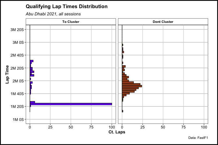
First, it’s important to think about which laps we actually need to put effort into differentiating between fast and slow. The only laps that we’re interested in classifying are laps that are not In Laps or Out Laps. Below, we separate our laps before anything else to show a better picture on a smaller subset of laps that will actually get categorized:
ad_quali_2021_l <- ad_quali_2021_l %>%
  mutate(could_cluster = ifelse(is.na(PitOutTime) & is.na(PitInTime), "To Cluster", "Dont Cluster"),
         could_cluster = factor(could_cluster, levels = c("To Cluster",
                                                          "Dont Cluster")))

# viz: splitting out relevant laps

ad_quali_2021_l %>%
  ggplot(aes(y = LapTime5, fill = could_cluster)) +
  geom_histogram(color = "black",
                 bins = 100,
                 show.legend = FALSE) +
  labs(title = "Qualifying Lap Times Distribution",
       subtitle = "Abu Dhabi 2021, all sessions",
       x = "Ct. Laps",
       y = "Lap Time",
       caption = "Data: FastF1") +
  sec_lab_convert(axis = "y") +
  coord_cartesian(ylim = c(60, 200)) +
  facet_wrap(~could_cluster,
             nrow = 1) +
  scale_fill_manual(values = c("To Cluster" = "#7a00f5",
                               "Dont Cluster" = "#ab511d")) +
  theme_main() +
  theme_main_add()
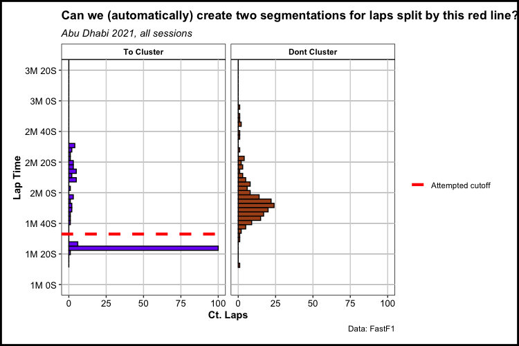
Below is a visualization of our goal: to separate laps in the “To Cluster” category between what we believe to be Fast Laps (below the dotted red line) from what we believe to be Slow Laps (above the dotted red line). This particular red line was manually placed there by me, but it represents what we’re trying to replicate. Using a form of clustering known as single-linkage Hierarchical Clustering, we are looking for the two laps with the most seconds between them and then using the space between those two laps as our boundary for classifying Fast vs. Slow laps.
ad_quali_2021_l %>%
  ggplot(aes(y = LapTime5, fill = could_cluster)) +
  geom_histogram(# fill = "purple",
                 color = "black",
                 bins = 100,
                 show.legend = FALSE) +
  labs(title = "Can we (automatically) create two segmentations for laps split by this red line?",
       subtitle = "Abu Dhabi 2021, all sessions",
       x = "Ct. Laps",
       y = "Lap Time",
       color = "",
       caption = "Data: FastF1") +
  sec_lab_convert(axis = "y") +
  coord_cartesian(ylim = c(60, 200)) +
  geom_hline(aes(yintercept = ifelse(could_cluster == "To Cluster", 93, NA),
                 group = raceName,
                 color = "Attempted cutoff"),
                 linetype = "dashed",
             size = 1.5) +
  facet_wrap(~could_cluster,
             nrow = 1) +
  scale_color_manual(values = c("Attempted cutoff" = "red")) +
  scale_fill_manual(values = c("To Cluster" = "#7a00f5",
                               "Dont Cluster" = "#ab511d")) +
  theme_main() +
  theme_main_add()
So let’s create our clustering model. First, we remove any laps that are either In Laps or Out Laps:
# hclust code here (non-function?)

# create filtered data

exclude = c("InLap_flag", "OutLap_flag")
exclude_list <- do.call(paste0, list(exclude))

ad_quali_2021_l_clust <- ad_quali_2021_l %>%
  filter(if_all(all_of(exclude_list), ~ . == "0")) %>%
  select(Driver, LapNumber, LapTime5)
And below, we use the hclust() function from R to create a hierarchical clustering model based off of LapTime5 only, and additionally designate this as a single-linkage model by using the method = “single” argument. We specify the number of clusters to create with cutree(2), one cluster for fast laps and one for slow laps. In our data, our clusters are stored in a variable named: hclust. In the last part of the code below, we join our cluster variable to our main dataset of Abu Dhabi qualifying laps - ad_quali_2021_l - that we’ve been working with for most of this project so far.
From here on:
- Cluster 1 will be our fast laps
- Cluster 2 will be our slow laps
- Cluster NA will be laps that were either In Laps, Out Laps, or laps aborted in sector 3
# create hclust on filtered data

ad_quali_2021_l_clust$hclust <- ad_quali_2021_l_clust %>%
  select(LapTime5) %>%
  dist() %>%
  hclust(method = "single") %>%
  cutree(2) %>%
  factor()

# join filtered data onto raw data

ad_quali_2021_l <- ad_quali_2021_l %>%
  left_join(select(ad_quali_2021_l_clust, -LapTime5), by = c("Driver", "LapNumber"))
Now we can return to our set of 4 Verstappen laps in Q2 and look at the newly-created hclust variable within the data. The two In Laps / Out Laps are shown as NA, the slow non-In Lap / Out Lap was predicted to be in cluster 2, with the much faster lap being predicted to be in cluster 1.
ad_VER_focus_laps <- ad_quali_2021_l %>%
  select(Driver, DriverNumber, LapNumber, PitInTime, PitOutTime,
         Sector1SessionTime, Sector2SessionTime, Sector3SessionTime,
         Sector1Time, Sector2Time, Sector3Time, LapTime,
         LapTime5, hclust) %>%
  mutate(ver_focus_flag = "1") %>%
  dplyr::filter(Driver == "VER",
                between(LapNumber, 7, 10))


ad_VER_focus_laps %>%
  select(Driver, DriverNumber, LapNumber,
         PitInTime, PitOutTime, LapTime5, hclust) %>%
  as.data.frame()
  Driver DriverNumber LapNumber PitInTime PitOutTime LapTime5 hclust
1    VER           33         7       NaN   2596.296  103.320   <NA>
2    VER           33         8       NaN        NaN   83.189      1
3    VER           33         9       NaN        NaN  151.478      2
4    VER           33        10  3036.302        NaN  103.156   <NA>
Aborted Laps
Even for laps that are intended as Fast Laps, there are cases in which these laps should not be classified as such. For example, drivers in Q1 or Q2 on the verge of eliminated may start a fast lap and then subsequently abort that lap at the last second if other drivers do not succeed in scoring faster laps - as there can be little to no point to finish a lap where there is another session to compete in and no danger of elimination. The code below specifically checks for cases where drivers had competitive Sector 1 and Sector 2 times in a lap, but fell off drastially in Sector 3. We assume these laps to be “aborted” and the logic removes them from the Fast Lap cluster - hclust: 1, if so.
ad_quali_2021_l_clust1 <- ad_quali_2021_l %>%
  filter(hclust == 1) %>%
  select(season, raceName,Driver, DriverNumber, LapNumber, session_number_coal, lap_start_rownum, Compound, hclust, LapTime5, Sector3Time) %>%
  mutate(scaled_Sector3Time = scale(Sector3Time)) %>%
  # cant do aborted lap logic until here, after filtering to only fast laps
  # aborted lap logic
  group_by(season, raceName, Driver, Compound) %>%
  arrange(season, raceName, Driver, Compound, lap_start_rownum) %>%
  mutate(last_driver_compound_LapTime5 = lag(LapTime5),
         last_driver_compound_delta_sec = (LapTime5 - last_driver_compound_LapTime5),
         last_driver_compound_delta_pct = ((LapTime5 - last_driver_compound_LapTime5) / last_driver_compound_LapTime5)) %>%
  ungroup() %>%
  arrange(DriverNumber, Compound, lap_start_rownum) %>%
  # have to explicitly keep NAs here
  # remove any lap that is > 1% increase from previous lap on same compound (assuming outliers, not assoc. w/ track evo)
  # could also flag and then compare with and without..
  filter(is.na(last_driver_compound_delta_pct) | last_driver_compound_delta_pct <= .01) %>%
  filter(is.na(scaled_Sector3Time) | scaled_Sector3Time < 3) %>%
  ungroup() %>%
  mutate(hclust1_final = hclust) %>% # think i can remove this
  select(Driver, LapNumber, hclust1_final)

ad_quali_2021_l <- ad_quali_2021_l %>%
  left_join(ad_quali_2021_l_clust1, by = c("Driver", "LapNumber")) %>%
  mutate(hclust = ifelse(hclust == 1 & is.na(hclust1_final), NA, hclust),
         hclust = as.factor(as.character(hclust)))
Filtering to relevant analysis dataset
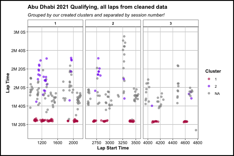
So finally, we can create a plot that encompasses all of the work above, that:
- Shows all available lap times, even those that have missing sector times or otherwise incomplete data
- Groups the laps by the session number they came in
- Classifies laps by the created clusters, denoting fast (cluster 1) laps from slow laps (cluster 2) and In Laps / Out Laps (Cluster NA) laps
ad_quali_2021_l %>%
  mutate(hclust = case_when(is.na(hclust) ~ "NA",
                            TRUE ~ as.character(hclust))) %>%
  ggplot(aes(x = coal_LapStartTime, y = LapTime5, color = hclust)) +
  geom_point(size = 2,
             alpha = 0.6) +
  labs(title = "Abu Dhabi 2021 Qualifying, all laps from cleaned data",
       subtitle = "Grouped by our created clusters and separated by session number!",
       x = "Lap Start Time",
       y = "Lap Time",
       color = "Cluster") +
  coord_cartesian(ylim = c(70,180)) +
  scale_x_continuous() +
  sec_lab_convert(axis = "y") +
  scale_color_manual(values = c("1" = "#b81f4f",
                                "2" = "#8400f0",
                                "NA" = "#8a8a8a")) +
  facet_wrap(~session_number_coal,
             nrow = 1,
             scales = "free_x") +
  theme_main() +
  theme_main_add()
So, we’ve now gotten to a point where we can look at only the fast laps from a qualifying session. Theoretically, if we were to begin an analysis now, we would almost certainly still see a decrease in overall lap times as the session progressed - as there is one variable still to account for: Car Strength.
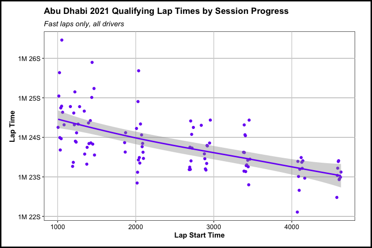
Another nuance about Formula One when compared to most, particularly American, sports is that there is historically very-little parity between the top teams and the bottom teams. So while, in the plot below, we see lap times decreasing from session 1-3, this could be due to track evolution or it could also be that the average performance of the cars remaining in Q3 are almost always going to be better than the cars in session participating in Q1. This brings up a problem of collinearity, which is a term in statistics used to describe multiple independent variables being associated with each other. So what does that mean? If we have track evolution decreasing lap times, and we have the general, increasing strength of the field decreasing lap times, then being able to measure the effect that those two variables, individually, have on decreasing lap times becomes more difficult.
ad_quali_2021_l %>%
  filter(hclust == 1) %>%
  ggplot(aes(x = coal_LapStartTime, y = LapTime5, color = hclust)) +
  geom_point(show.legend = FALSE) +
  geom_smooth(method = "gam",
              show.legend = FALSE) +
  labs(title = "Abu Dhabi 2021 Qualifying Lap Times by Session Progress",
       subtitle = "Fast laps only, all drivers",
       x = "Lap Start Time",
       y = "Lap Time",
       color = "Cluster") +
  scale_x_continuous() +
  sec_lab_convert(axis = "y",
                  start_sec = 70,
                  end_sec = 150,
                  int_sec = 1) +
  scale_color_manual(values = c("1" = "#7a00f5",
                                "2" = "#ab511d")) +
  theme_main() +
  theme_main_add()
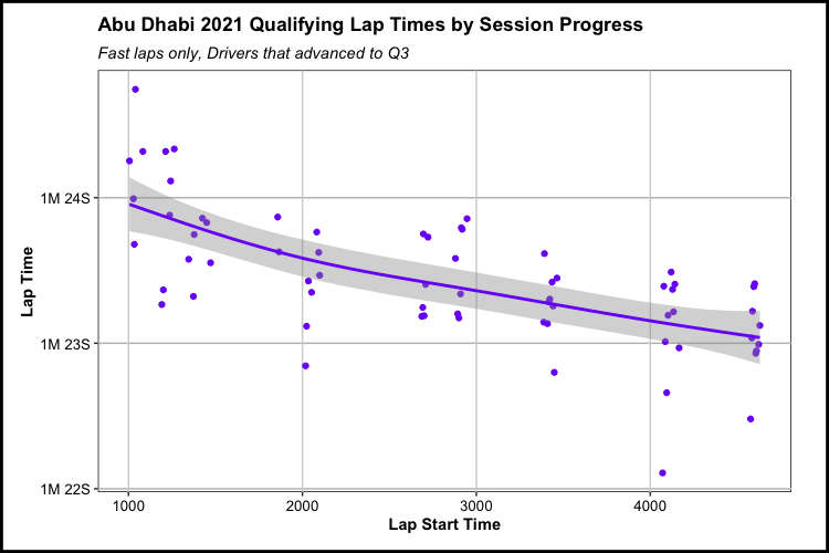
For this analysis, we will deal with this case by analyzing the laps of only drivers that ended up making it to Q3. With this, the strength of the field is constant across all sessions as all remaining laps are drivers that participated throughout. One thing to note, however, is that in doing this we do make our already-small sample of relevant laps even smaller.
# grabbing the drivers who advanced to Q3 during qualifying

ad_compile_q3_drivers <- ad_quali_2021_l %>%
  select(raceName, Driver, session_number_coal) %>%
  group_by(raceName, Driver) %>%
  summarize(max_session = max(as.numeric(as.character(session_number_coal))),
            .groups = "drop") %>%
  filter(max_session == 3)
# filtering on drivers who made Q3 via inner join
# then. filtering explicitly on only fast laps (hclust == 1)

ad_quali_2021_l_fast_compile <- ad_quali_2021_l %>%
  inner_join(ad_compile_q3_drivers, by = c("Driver" = "Driver",
                                           "raceName" = "raceName")) %>%
  filter(hclust == 1)

# drivers remaining

ad_quali_2021_l_fast_compile %>%
  group_by(DriverNumber, Driver) %>%
  summarize(total_fast_laps = n(),
            max_session_number = max(as.numeric(as.character(session_number_coal))))
# A tibble: 10 × 4
# Groups:   DriverNumber [10]
   DriverNumber Driver total_fast_laps max_session_number
   <chr>        <chr>            <int>              <dbl>
 1 11           PER                  8                  3
 2 16           LEC                  8                  3
 3 22           TSU                  7                  3
 4 3            RIC                  6                  3
 5 31           OCO                  7                  3
 6 33           VER                  5                  3
 7 4            NOR                  7                  3
 8 44           HAM                  6                  3
 9 55           SAI                  6                  3
10 77           BOT                  7                  3
Finally, data preparation is done and the data is ready for analyzing track evolution. In the plot below, there is a trend downwards in lap times for the drivers that participated in all three sessions. Generally speaking, it looks like lap times decreased between around 0.75 seconds to 1 second on average from the start of qualifying to the end.
ad_quali_2021_l_fast_compile %>%
  ggplot(aes(x = coal_LapStartTime, y = LapTime5, color = hclust)) +
  geom_point(show.legend = FALSE) +
  geom_smooth(method = "gam",
              show.legend = FALSE) +
  labs(title = "Abu Dhabi 2021 Qualifying Lap Times by Session Progress",
       subtitle = "Fast laps only, Drivers that advanced to Q3",
       x = "Lap Start Time",
       y = "Lap Time",
       color = "Cluster") +
  scale_x_continuous() +
  sec_lab_convert(axis = "y",
                  start_sec = 70,
                  end_sec = 150,
                  int_sec = 1) +
  scale_color_manual(values = c("1" = "#7a00f5",
                                "2" = "#ab511d")) +
  theme_main() +
  theme_main_add()
Analysis
Now it’s time to build a statistical model. For a descriptive analysis like this - where we’re not necessarily interested in predicting outcomes, but rather in describing and measuring the patterns, trends, and behaviors that the data contains. There are a variety of models we can use to do accomplish this. Ideally we are looking for a model that’s simple enough to interpret and explain, but possesses the ability to capture any non-linear or more-complicated trends that come up in our small data.
Generalized Additive Models (GAM) are a great candidate to solve for these needs as they have more flexibility (no pun intended) in comparison to linear models - thanks to their usage of basis functions, but are also relatively-interpretable compared to fancier black box machine learning algorithms The mgcv package is a great tool for fitting GAMs, and below is code that instantiates a GAM model object.
The model created below: ad_q3_driver_gam is taking Lap Times as a function of session progress (lap_start_rownum, the running total of laps run by all drivers in a session), tire compound, and team.
ad_q3_driver_gam <- mgcv::gam(LapTime5 ~ s(lap_start_rownum, by = Compound) + Compound + Team,
                              data = ad_quali_2021_l_fast_compile, method = "REML")
Modeling over observed data
# modeling over observed data

ad_q3_driver_preds <- broom::augment(ad_q3_driver_gam, data = ad_quali_2021_l_fast_compile) %>%
  select(DriverNumber, Driver, LapNumber, lap_start_rownum, Compound, Team,
         session_number_coal, LapTime5, .fitted, .se.fit, .resid) %>%# View()
  mutate(lower = .fitted - 1.96 * .se.fit,
         upper = .fitted + 1.96 * .se.fit)
Here we can see a 6 row preview of the “observed” data used for model training. Using the augment function from the broom package, the model is fit to the observed data. This function also creates a series of model fit columns attached to the end of the dataset: .fitted, .se.fit, .resid, lower, upper
ad_q3_driver_preds %>%
  head() %>%
  as.data.frame()
  DriverNumber Driver LapNumber lap_start_rownum Compound            Team session_number_coal LapTime5  .fitted    .se.fit     .resid    lower    upper
1           33    VER         2               16     SOFT Red Bull Racing                   1   83.680 83.79090 0.09479842 -0.1108957 83.60509 83.97670
2           33    VER         5               76     SOFT Red Bull Racing                   1   83.322 83.49598 0.07268155 -0.1739773 83.35352 83.63843
3           33    VER         8              175   MEDIUM Red Bull Racing                   2   83.189 83.46989 0.08903180 -0.2808919 83.29539 83.64439
4           33    VER        12              248     SOFT Red Bull Racing                   2   82.800 82.96897 0.07414968 -0.1689707 82.82364 83.11430
5           33    VER        15              277     SOFT Red Bull Racing                   3   82.109 82.91766 0.07113828 -0.8086554 82.77822 83.05709
6           44    HAM         2               44     SOFT        Mercedes                   1   83.266 83.45849 0.08345470 -0.1924914 83.29492 83.62206
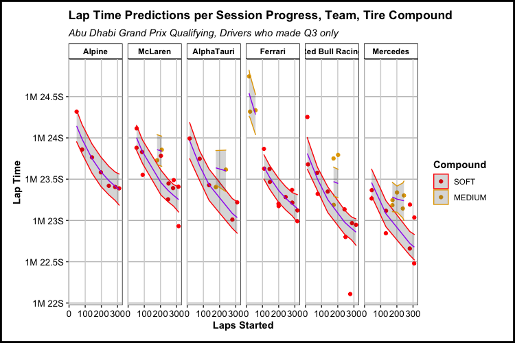
Below is a visualization of the fit of the GAM model for Abu Dhabi qualifying. The laps and any usage of model outputs for laps under medium tires will all but be thrown away, but it’s still kind of interesting to see the difference in lap time for teams that use both the soft and medium compound tires.
# plot: model over observed data

ad_q3_driver_preds %>%
  ggplot(aes(x = lap_start_rownum, y = LapTime5, color = Compound)) +
  geom_point() +
  geom_ribbon(aes(ymin = lower, ymax = upper), alpha = 0.2) +
  geom_line(aes(x = lap_start_rownum, y = .fitted, group = Compound), color = "purple") +
  labs(title = "Lap Time Predictions per Session Progress, Team, Tire Compound",
       subtitle = "Abu Dhabi Grand Prix Qualifying, Drivers who made Q3 only",
       x = "Laps Started",
       y = "Lap Time") +
  sec_lab_convert(axis = "y",
                  start_sec = 60,
                  end_sec = 180,
                  int_sec = 0.5) +
  facet_wrap(~fct_reorder(Team, -LapTime5),
             nrow = 1) +
  scale_color_manual(values = c("SOFT" = "RED",
                                "MEDIUM" = "#e3a600")) +
  theme_main() +
  theme_main_add()
Modeling over predicted data
The final step for modeling Abu Dhabi qualifying is to create a final dataframe to apply the trained model on. For that, we create a new dataset for soft compound tires only - featuring as many laps per team as were run throughout the entire qualifying session.
ad_max_laps_team_data <- ad_quali_2021_l_fast_compile %>%
  select(season, raceName, Team, lap_start_rownum) %>%
  group_by(season, raceName, Team) %>%
  summarize(min_lap_start_rownum = min(lap_start_rownum),
            start_session = 1, # dont think i need this
            max_lap_start_rownum = max(lap_start_rownum)) %>%
  ungroup()


fit_predict_df <- ad_max_laps_team_data %>%
  group_by(season, raceName) %>%
  expand(Team,
         lap_start_rownum = 1:max(max_lap_start_rownum),
         Compound = "SOFT") %>%
  ungroup()

fit_predict_df %>% head()
  season raceName  Team       lap_start_rownum Compound
   <dbl> <chr>     <chr>                 <int> <chr>
1   2021 Abu Dhabi AlphaTauri                1 SOFT
2   2021 Abu Dhabi AlphaTauri                2 SOFT
3   2021 Abu Dhabi AlphaTauri                3 SOFT
4   2021 Abu Dhabi AlphaTauri                4 SOFT
5   2021 Abu Dhabi AlphaTauri                5 SOFT
6   2021 Abu Dhabi AlphaTauri                6 SOFT
The GAM model is then fitted to the new dataset and outputs fitted lap times for each team regardless of when they actually ran laps in qualifying. In doing so, this gives us fairly large confidence bands for the laps in which a team did not have a lap ran, for example: Ferrari who used medium compound tires at the beginning of qualifying for some reason. Since the model was trained with both session progress and tire compounds in mind per team, there can still be a lap time fitted with reduced confidence in its accuracy.
ad_fit_predict_preds <- broom::augment(ad_q3_driver_gam, newdata = fit_predict_df) %>%
  # select(DriverNumber, Driver, LapNumber, lap_start_rownum, Compound, Team,
  #        session_number_coal, LapTime5, .fitted, .se.fit, .resid) %>%# View()
  mutate(lower = .fitted - 1.96 * .se.fit,
         upper = .fitted + 1.96 * .se.fit)
The plot below shows that, as a whole, Mercedes was consistently faster throughout qualifying. However, Red Bull’s Max Verstappen had the fastest lap of the session which came with help from a tow by his teammate Sergio Perez.
# plot: model over predicted data

ad_fit_predict_preds %>%
  ggplot(aes(x = lap_start_rownum, y = .fitted)) +
  geom_point(data = ad_q3_driver_preds %>%
                      filter(Compound == "SOFT"),
             aes(x = lap_start_rownum, y = LapTime5,
                 color = Driver)
             ) +
  geom_line(color = "red") +
  geom_ribbon(aes(ymin = lower, ymax = upper), alpha = 0.2) +
  labs(title = "Lap Time Predictions over Session Progress",
       subtitle = "Abu Dhabi Grand Prix Qualifying, Drivers who made Q3 only",
       x = "Laps Started",
       y = "Lap Time") +
  sec_lab_convert(axis = "y",
                  start_sec = 60,
                  end_sec = 180,
                  int_sec = 0.5) +
  facet_wrap(~fct_reorder(Team, -.fitted),
             nrow = 1) +
  theme_main() +
  theme_main_add()
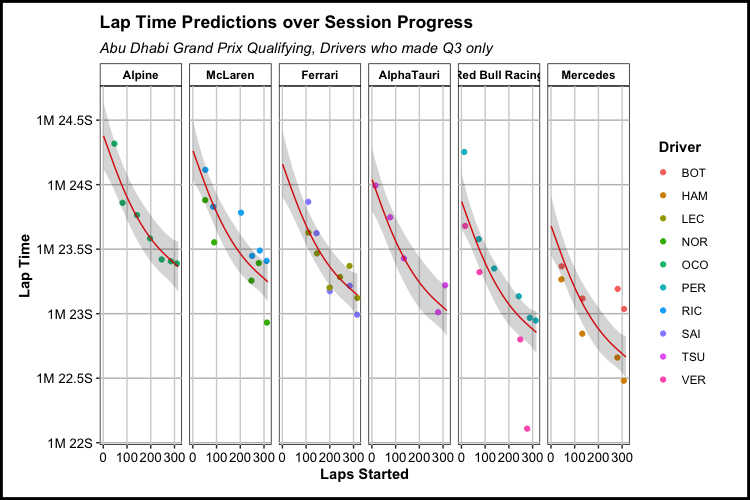
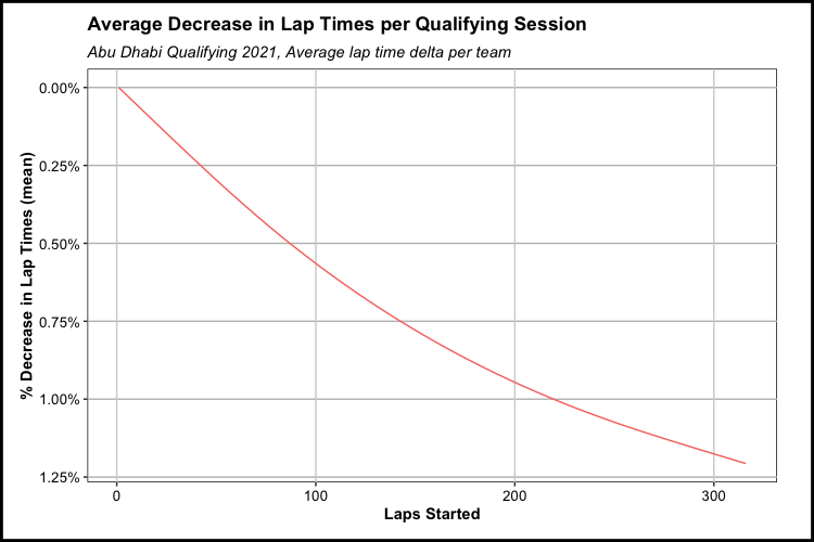
According to the GAM, there was about a 1.2% decrease in lap times for drivers that made Q3 from the start to finish of Abu Dhabi’s qualifying. Creating a model per track will let us compare respective decreases in lap times throughout (most of) the entire season.
ad_quali_gam_pred_agg <- ad_fit_predict_preds %>%
  group_by(raceName, lap_start_rownum) %>%
  summarize(raceName_mean_fitted = mean(.fitted)) %>%
  group_by(raceName) %>%
  mutate(raceName_first_fitted = first(raceName_mean_fitted),
         raceName_last_fitted = last(raceName_mean_fitted),
         mean_pct_decrease_evo = ((raceName_first_fitted - raceName_mean_fitted) / raceName_first_fitted),
         raceName_last_laps_start_rownum = last(lap_start_rownum),
         pct_raceName_laps = (lap_start_rownum / raceName_last_laps_start_rownum)) %>%
  ungroup()


ad_quali_gam_pred_agg %>%
  ggplot(aes(x = lap_start_rownum, y = mean_pct_decrease_evo,
             color = raceName)) +
  geom_line(show.legend = FALSE) +
  # geom_point() +
  labs(title = "Average Decrease in Lap Times per Qualifying Session",
       subtitle = "Abu Dhabi Qualifying 2021, Average lap time delta per team",
       x = "Laps Started",
       y = "% Decrease in Lap Times (mean)",
       color = "Race") +
  scale_x_continuous() +
  scale_y_reverse(labels = scales::percent_format(accuracy = 0.01)) +
  theme_main() +
  theme_main_add()
Parameterizing: Fitting many models
For this section, I am not going to be posting as much of the code that produces the result below. The main concepts of the code are all above, but those concepts have been taken and turned into functions and reproducible R code so that we can apply that code to each qualifying session throughout the year.
That code lives within the f1_track_evo_expand.Rmd file in my Github repo here.
The important function below is compile_driver_data that is being called within the the purrr package’s map_df function. Within compile_driver_data are a series of created functions that serve to clean and cluster the data, which was seen earlier in this analysis. This is just an extra tool to apply that code, plus some additional code to deal with the intricacies that come from other qualifying sessions (mainly red flags that cause one or more prolonged stoppages), to an entire season of qualifying sessions.
As seen in the code below, we are also removing three qualifying sessions that featured wet conditions. Since the goal of the analysis is to measure the decrease in laptimes while holding as many variables as possible constant, wet track conditions are problematic in that they can do anything from wiping out all rubber/grip that had been built up on the track to that point in a race weekend to conditions varying from the start of a session to the end. This was seen in Turkey this past season, where the start of the session saw a wet track conditions that improved to dry over the course of qualifying. When this happens, the track evolution seen is surely due to improving conditions which isn’t what the point of this analysis is. Though, it would be interesting to do a separate analysis on lap times against weather conditions.
# need to exclude / replace sprint qualifyings with traditional qualifying?

wet_qualis_2021 <- c("Belgian Grand Prix",
                     "Russian Grand Prix",
                     "Turkish Grand Prix")

circuits_2021 <- get_weekend_gp(season = '2021') %>%
  dplyr::filter(!(raceName %in% wet_qualis_2021)) %>%
  select(raceName, round, season)

ad_compile_test_mult <- circuits_2021$raceName %>%
  map_df(~ compile_driver_data(season = '2021',
                               circuit = .x,
                               # session = NULL,
                               driver = 'ALL',
                               data_type = 'laps',
                               cached_flag = 'True'))
The bread and butter of this portion of the analysis comes from a concept used in R called nesting. Nesting, in this case, allows us to iterate a function within individual qualifying sessions rather than over an entire season’s worth of data.
Below is a nested dataframe. Instead of having a row for every lap, we have a row for every qualifying session in 2021. Within these rows are objects - lap-level dataframes, model parameters, objects, and outputs, all nested within the 19 row dataframe.
quali_gam_df
# A tibble: 19 × 9
   season raceName                  len_Compound gam_lambda data               gam_model preds_obs          pred_data            preds_new
    <dbl> <chr>                            <int>      <dbl> <list>             <list>    <list>             <list>               <list>
 1   2021 Bahrain Grand Prix                   2          4 <tibble [49 × 54]> <gam>     <tibble [49 × 10]> <tibble [1,687 × 3]> <tibble [1,687 × 5]>
 2   2021 Emilia Romagna Grand Prix            2         NA <tibble [57 × 54]> <gam>     <tibble [55 × 10]> <tibble [2,149 × 3]> <tibble [2,149 × 5]>
 3   2021 Portuguese Grand Prix                2         NA <tibble [67 × 54]> <gam>     <tibble [67 × 10]> <tibble [2,478 × 3]> <tibble [2,478 × 5]>
 4   2021 Spanish Grand Prix                   2         NA <tibble [49 × 54]> <gam>     <tibble [49 × 10]> <tibble [1,230 × 3]> <tibble [1,230 × 5]>
 5   2021 Monaco Grand Prix                    1          4 <tibble [77 × 54]> <gam>     <tibble [77 × 9]>  <tibble [2,884 × 3]> <tibble [2,884 × 5]>
 6   2021 Azerbaijan Grand Prix                1         NA <tibble [41 × 54]> <gam>     <tibble [41 × 9]>  <tibble [1,632 × 3]> <tibble [1,632 × 5]>
 7   2021 French Grand Prix                    2         NA <tibble [55 × 54]> <gam>     <tibble [55 × 10]> <tibble [1,554 × 3]> <tibble [1,554 × 5]>
 8   2021 Styrian Grand Prix                   2         NA <tibble [62 × 54]> <gam>     <tibble [62 × 10]> <tibble [2,128 × 3]> <tibble [2,128 × 5]>
 9   2021 Austrian Grand Prix                  2         NA <tibble [61 × 54]> <gam>     <tibble [61 × 10]> <tibble [1,728 × 3]> <tibble [1,728 × 5]>
10   2021 British Grand Prix                   1         NA <tibble [65 × 54]> <gam>     <tibble [65 × 9]>  <tibble [1,746 × 3]> <tibble [1,746 × 5]>
11   2021 Hungarian Grand Prix                 2          4 <tibble [51 × 54]> <gam>     <tibble [51 × 10]> <tibble [1,701 × 3]> <tibble [1,701 × 5]>
12   2021 Dutch Grand Prix                     2         NA <tibble [50 × 54]> <gam>     <tibble [50 × 10]> <tibble [1,890 × 3]> <tibble [1,890 × 5]>
13   2021 Italian Grand Prix                   1         NA <tibble [57 × 54]> <gam>     <tibble [57 × 9]>  <tibble [1,674 × 3]> <tibble [1,674 × 5]>
14   2021 United States Grand Prix             2         NA <tibble [50 × 54]> <gam>     <tibble [50 × 10]> <tibble [1,185 × 3]> <tibble [1,185 × 5]>
15   2021 Mexico City Grand Prix               2         NA <tibble [54 × 54]> <gam>     <tibble [54 × 10]> <tibble [1,515 × 3]> <tibble [1,515 × 5]>
16   2021 São Paulo Grand Prix                 1         NA <tibble [69 × 54]> <gam>     <tibble [69 × 9]>  <tibble [1,872 × 3]> <tibble [1,872 × 5]>
17   2021 Qatar Grand Prix                     2         NA <tibble [60 × 54]> <gam>     <tibble [60 × 10]> <tibble [2,100 × 3]> <tibble [2,100 × 5]>
18   2021 Saudi Arabian Grand Prix             2         NA <tibble [75 × 54]> <gam>     <tibble [75 × 10]> <tibble [2,457 × 3]> <tibble [2,457 × 5]>
19   2021 Abu Dhabi Grand Prix                 2         NA <tibble [67 × 54]> <gam>     <tibble [67 × 10]> <tibble [1,896 × 3]> <tibble [1,896 × 5]>
The objects that are created for each qualifying session are:
-
len_Compound
- This is just a plain, old integer representing the maximum number of tires used in a qualifying session for any team. In most qualifying sessions throughout the season, the top teams would elect to at least attempt a stint in Q2 on the medium compound. This integer is used as a condition for determining which of the following models to use, per qualifying. If there were more than compound of tires used in a qualifying session - then add compound as a variable in the model, if not - leave compound out of the model. Once again, leaving compound in the model was mostly to satisfy my curiosity, rather than having any serious reason due to the very low sample of laps that used medium compound tires in comparison to the softs.
-
gam_lambda
- This is another integer, referred to as lambda ( λ ), which is used as a penalty parameter. When the models are created, we want to capture non-linear trends without our fitted model being a straight line or too “wiggly”. The λ value allows us to adjust the “wigglyness” of each model. For the majority of the 19 qualifying sessions that we built GAM models for, we let the model default to its own λ value. However, for Bahrain, Hungary, and Monaco our models were not generalizing to the data well (known as over-fitting) and needed this parameter set manually. In each case, setting λ = 4 allowed us to remove excessive wigglyness.
-
data
- The “original” dataframe featuring the fast laps for all drivers per qualifying session.
-
gam_model
- A GAM object that is created using the data dataframe.
-
preds_obs
- Seen in the beginning of the Analysis section, a dataframe containing each lap observed from data, but with GAM model outputs (“predictions”, confidence intervals, .etc) built from gam_model.
-
pred_data
- The dataframe created that contains one lap, per team, per qualifying session, all on soft compound tires. This is the dataframe that allows us to analyze the many GAM models on data that may have not been seen in the actual qualifying sessions.
quali_gam_df %>%
  dplyr::filter(raceName == "Bahrain Grand Prix") %>%
  unpack_safely(col = "pred_data",
                add_conf = TRUE) %>%
  head() %>%
  as.data.frame()
  season           raceName len_Compound gam_lambda       Team lap_start_rownum Compound
1   2021 Bahrain Grand Prix            2          4 AlphaTauri                1     SOFT
2   2021 Bahrain Grand Prix            2          4 AlphaTauri                2     SOFT
3   2021 Bahrain Grand Prix            2          4 AlphaTauri                3     SOFT
4   2021 Bahrain Grand Prix            2          4 AlphaTauri                4     SOFT
5   2021 Bahrain Grand Prix            2          4 AlphaTauri                5     SOFT
6   2021 Bahrain Grand Prix            2          4 AlphaTauri                6     SOFT
- preds_new
- A dataframe that contains pred_data and additional columns for GAM model outputs that result from applying the gam_model to pred_data.
quali_gam_df %>%
  dplyr::filter(raceName == "Bahrain Grand Prix") %>%
  unpack_safely(col = "preds_new",
                add_conf = TRUE) %>%
  head()
  season           raceName len_Compound gam_lambda       Team lap_start_rownum Compound  .fitted   .se.fit    lower    upper
1   2021 Bahrain Grand Prix            2          4 AlphaTauri                1     SOFT 91.59813 0.1908547 91.22406 91.97221
2   2021 Bahrain Grand Prix            2          4 AlphaTauri                2     SOFT 91.58921 0.1894728 91.21784 91.96058
3   2021 Bahrain Grand Prix            2          4 AlphaTauri                3     SOFT 91.58029 0.1881098 91.21159 91.94898
4   2021 Bahrain Grand Prix            2          4 AlphaTauri                4     SOFT 91.57137 0.1867660 91.20530 91.93743
5   2021 Bahrain Grand Prix            2          4 AlphaTauri                5     SOFT 91.56244 0.1854420 91.19898 91.92591
6   2021 Bahrain Grand Prix            2          4 AlphaTauri                6     SOFT 91.55352 0.1841382 91.19261 91.91443
Conclusion
After pulling, cleaning, and building models for each qualifying session in the 2021 season, we can compare which circuits had the largest average decreases in lap times. Many sessions have different trends that occur as qualifying progressed, some are pretty linear and others - like Saudi Arabia - can take on more-complex shapes, a good indicator of track evolution having different behaviors at different circuits throughout the season.
As an example, Mexico City saw a steep decrease in lap times from the start of qualifying and saw the biggest percent change. On the contrary, Portugal saw the least. There are pretty good reasons for each of these, as mentioned on the broadcast for Mexico City’s qualifying - it is a circuit that hardly gets used outside of the F1 race weekend. Combine the lack of usage with the dusty nature of Mexico City’s air, and the circuit is constantly evolving and improving as cars are able to get laps in, which cleans the track surface and lays rubber down in the process. Portugal, on the other hand, is a very smooth track surface with very little grip. The racing there is challenging for drivers as they struggle to manage the many elevation changes in combination with the track surface being one of the slickest that F1 has raced on in recent years.
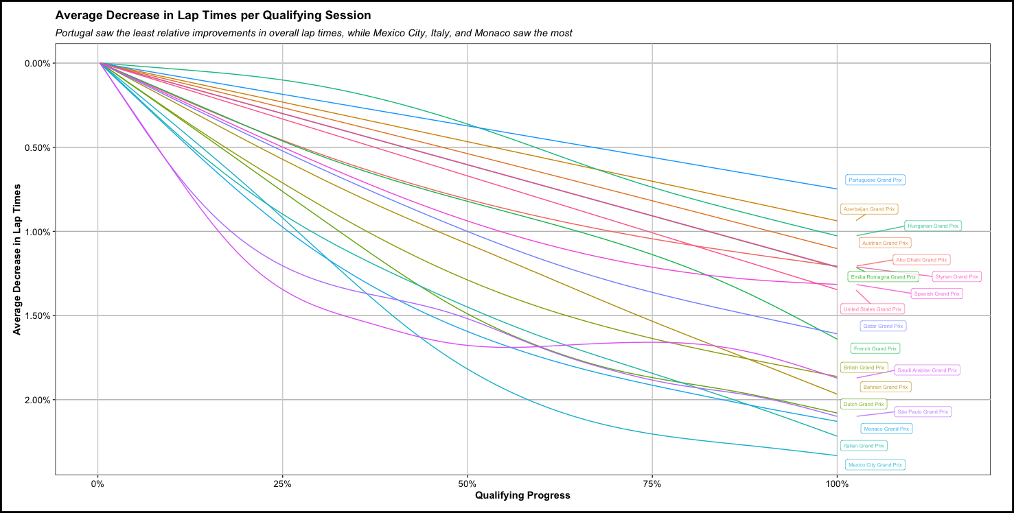
With a descriptive analysis such as this one - the exact rankings of how much track evolution each circuit experienced during qualifying can and definitely should be up for debate. However, I feel comfortable enough in using this as a directional tool for how a lot of circuits behaved last year. Perhaps a bit too pronounced in the model, but I especially enjoy the Saudi Arabia track evolution, as it is evident how drivers were still adapting to a new track in the beginning of the evening session, then the setting sun rapidly cooled the track and therefore decreased lap times towards the end of qualifying. To close, one fallback of this particular analysis is really the lack of Apples-to-Apples lap data to create robust models for - as in throwing out all practice and race lap data in favor of qualifying. F1 teams have far more internal data at their disposal to inform their decisions for simple things like track evolution, but I hope that this at least gives some insight in walking through an analysis from data acquisition, to cleaning, and plotting. Until next time, cheers!